Learn It
A mobile app where learning and
fun are friends
Context
I heard my daughters and their friends who are all in College, talk about their strategies to learn and retain new information. My ears perked up as I needed to find a project for my UX Design course and that’s how the process of designing an app that would help students, of all age, learn new topics without feeling overwhelmed while making it enjoyable began. Follow me along as I share my discoveries, challenges, and resolutions.
Duration
4 weeks
Role
UX Research
UX Designer
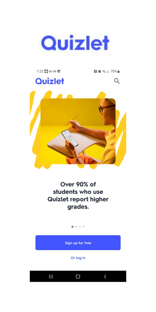
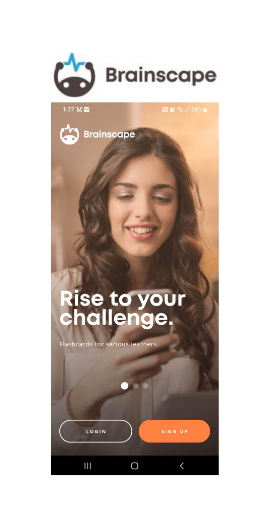
I was curious and wondered what was already on the market so I conducted a competitor research and analysis:
No distractions, no fluff, no ads
Simple, easy, and intuitive
No onboarding process
Design is bland and boring
Great Onboarding process
Learn and simple way to sign up/log in right at the beginning
Study and share with classmates
Need to upgrade to add pictures and sounds
A lot of ads
Great Onboarding process
No ads
Need to upgrade to add pictures and sounds
All three apps offer to:
Download decks already created
Create personalized decks
Learning about what already exists was very interesting and figuring out what was missing and what I could create that would differentiate my design was a challenge. I don’t know what I don’t know so it will be very important for me to keep learning... fortunately, that’s something I love to do!!!
Next, I conducted a user research to know about their learning process and experience.
I met, remotely, with 5 women of diverse background aged between 20 and 46 years old (it’s never too late to go to school) living in different parts of the United States and Canada. Here are the results:
Flashcards, fill-in-the-blanks, mini-quizzes, and games help understand the concepts and remember the vocabulary.
Love the ability to track their learning progress, and to collaborate or play with friends.
Like to organize information, get stats, and lock the phone on a timer while studying.
Learn in many different ways and loves when they can switch things up.
With all the juicy information I got from the interview, I had what I needed to create a User Persona that represented the users I was designing the app for.
Meet Chloe Roseberry
"Making learning fun is important and helps me get started when I feel the overwhelm."
"As a student with anxiety and ADHD, I want to be able to block off my phone when I'm on the app so I don't get distracted by notifications from social media apps or emails getting in."
She/Her
21 year-old
Full-time student at University of Maryland.
Senior Biochemistry undergraduate student and will pursue a Graduate program in the same field of study.
Single
Works part-time as a barista
Experiences anxiety and ADHD
Some of her behaviors:
She wants to hang out with friends so she organizes group study time. It fulfills her desire to socialize and her love of learning trough collaboration.
She makes learning fun for herself by using colors while taking her notes, playing with flashcards and manipulating them, and writing on her whiteboard.
Since she has ADHD, she found ways to study that works best for her: regular routine, takes frequent breaks, highlights and color codes her notes, uses movement to stay alert while studying.
Creating the user persona gave me a really strong foundation in knowing who this app will serve. Originally, I didn’t think about the mental health challenges that students face these days. I became aware of the importance of taking them into consideration in my design.
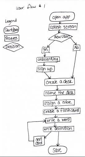
Then, it was time to put pen to paper, jolt down some ideas and create User Flows.
Task Analysis #1
Goal: Create and save flashcards into a color-coded deck.
Entry Point: Open App
Success Criteria: Save flashcards into a color-coded deck
Open App
Click on create a new deck
Name the deck
Assign a color
Click on create a flashcard
Write the word or concept
Write the definition
Save the deck
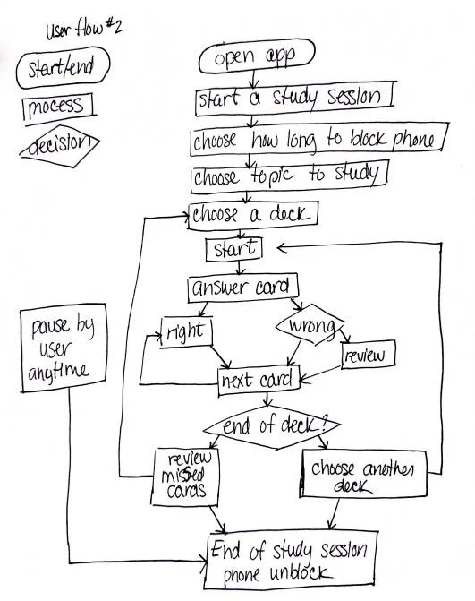
Task Analysis #2
Goal: Block off phone while studying for a chosen period of time.
Entry Point: Open App
Success Criteria: End of study session after the determined period of time.
Open App
Start study session
Choose how long to block phone
Choose topic to study
Choose a deck to study
Answer 1st card
Repeat step 6 until end of deck
Choose to review the missed cards or keep studying with another deck.
Pause study session before the end of set time
Game ends as a whole.
End of study session after chosen period of time
I found it challenging to think of every little steps that our persona could take to achieve a task and and all the possible tasks they would want to do. It’s one of the reasons I like to work with a team as we help each other with our different perspectives. Next, I had a creative session and roughly designed a few Low-Fidelity Wireframes. I appreciated the free flow of this step and the fact that we don’t have to make it perfect right off the bat. It’s less pressure and way more fun!
After I had my fun designing the wireframes, I was excited to have some feedback from real life users. I conducted three usability tests.
I used Jakob Nielsen’s error severity rating scale:
0 = I don't agree that this is a usability problem at all
1 = Cosmetic problem only: need not be fixed unless extra time is available on project
2 = Minor usability problem: fixing this should be given low priority
3 = Major usability problem: important to fix, so should be given high priority
4 = Usability catastrophe: imperative to fix this before product can be released
Here are the most important issues discovered:
Observations
Severity
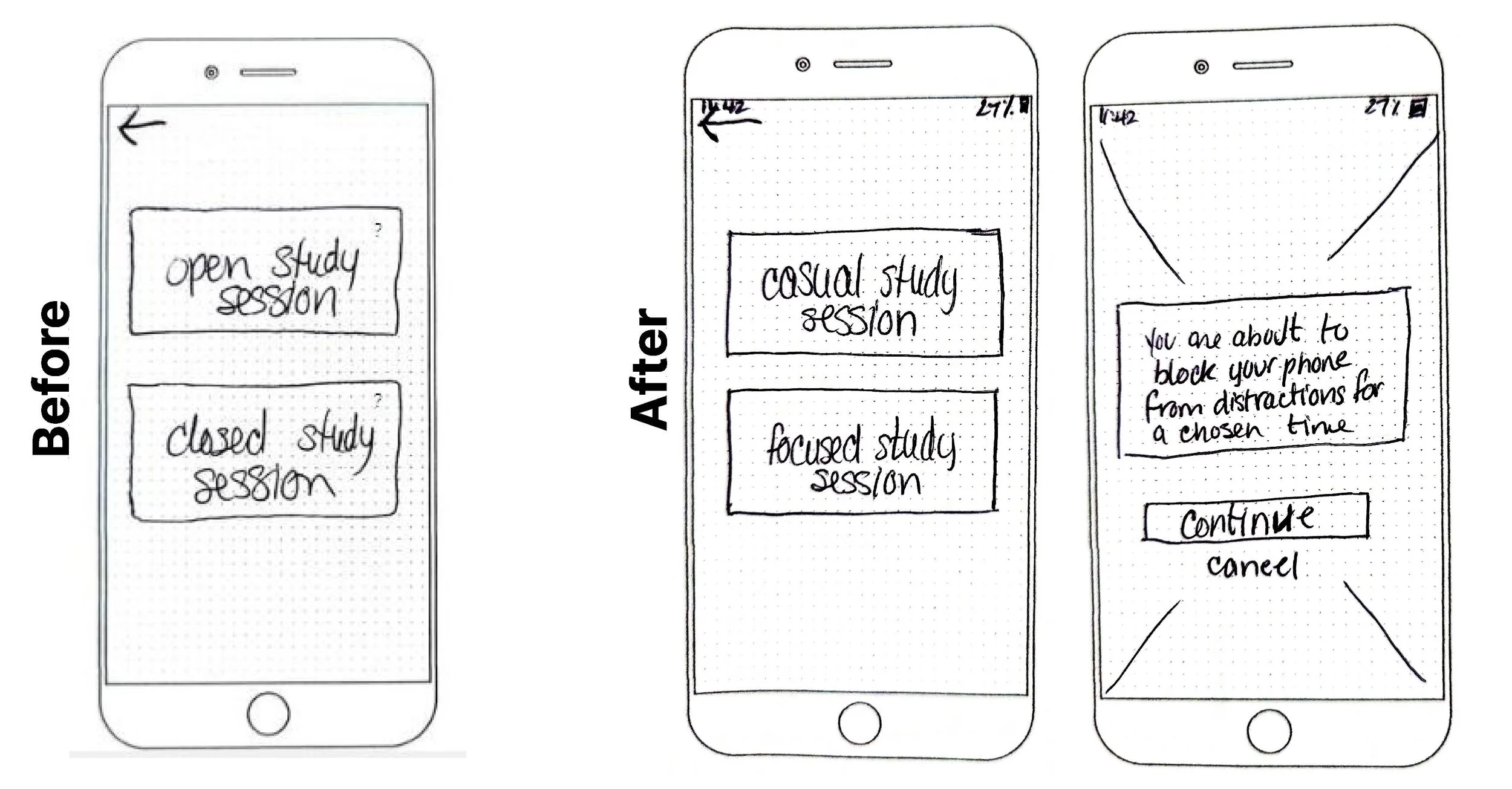
All three users were confused about the meaning of the “open” and “closed” study session options.
4
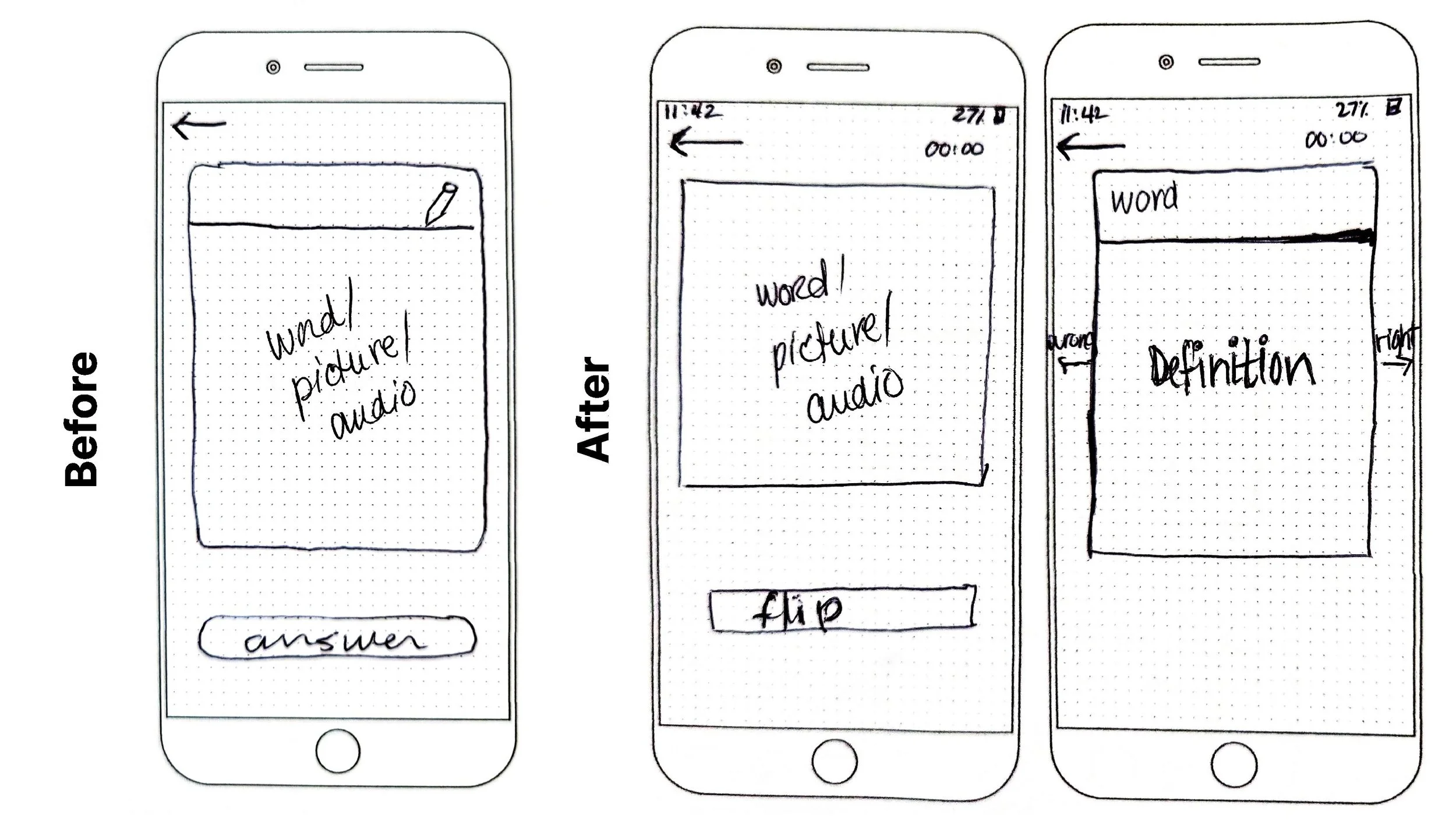
All three users were confused with the button that says “answer”. They thought they needed to type the answer.
4
Two users had varied recommendations about the pen icon on the flashcard and the timer.
3
One user commented on the swipe right/left option for right/wrong answer
2
Recommendations
Clarify the meaning of open and closed study session or change the wording.
Write the word “flip” on the button instead of “answer”.
1- Pen icon to edit the card is not necessary at this point in the process. If someone chooses a closed study session, they have the right content on their cards, no need to offer to change anything.
2- Show the timer go down.
Instead of the swipe right or left for right/wrong answer, have a legend at the bottom (1=didn’t know to 5=know very well) so the cards show back up in the rotation instead of at the end of the deck.
I love meeting with the users and get their feedback. One of my gifts is to make people comfortable so they feel like they can be honest with me. Based on the invaluable feedback I received, here are the changes I made to the low-fidelity prototype.
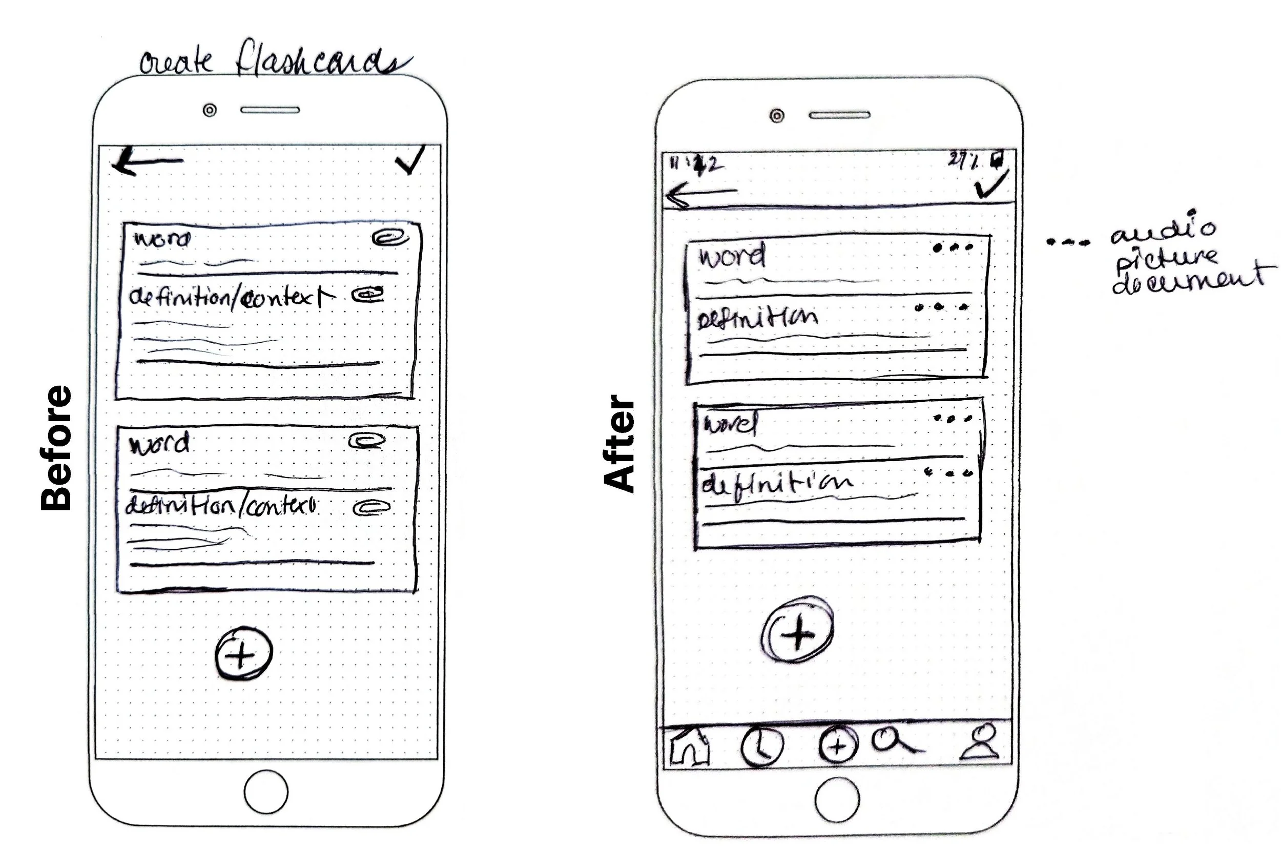
Here I changed the paper clip for the three dots as recommended with a menu that will open so the user can choose what kind of document they want to upload. I also added a navigation bar at the bottom of the screen to give an easy and quick way out to another screen.
Here I followed the recommendations and changed the wording from open study session to casual study session and from closed to focused. Then I added a warning screen to give an opportunity to the user to confirm their choice.
As recommended, I changed the word “answer” to “flip” as it was confusing for many users and it’s more representative of what we do with physical flashcards. I also removed the pencil but I would like to test this feature again, what if the user realizes that there is a mistake in the definition or wants to add precisions? I also added the word with above the definition.
In the future…
... I would like to create mid and high-fidelity prototypes.
... I would do more user testing and make more iterations based on the recommendations.
... I would develop more features like quests, a reward system, some motivational and personalized messages.
... I would explore the possibility of playing music to help with concentration and focus during study sessions.
Look at my other work:


