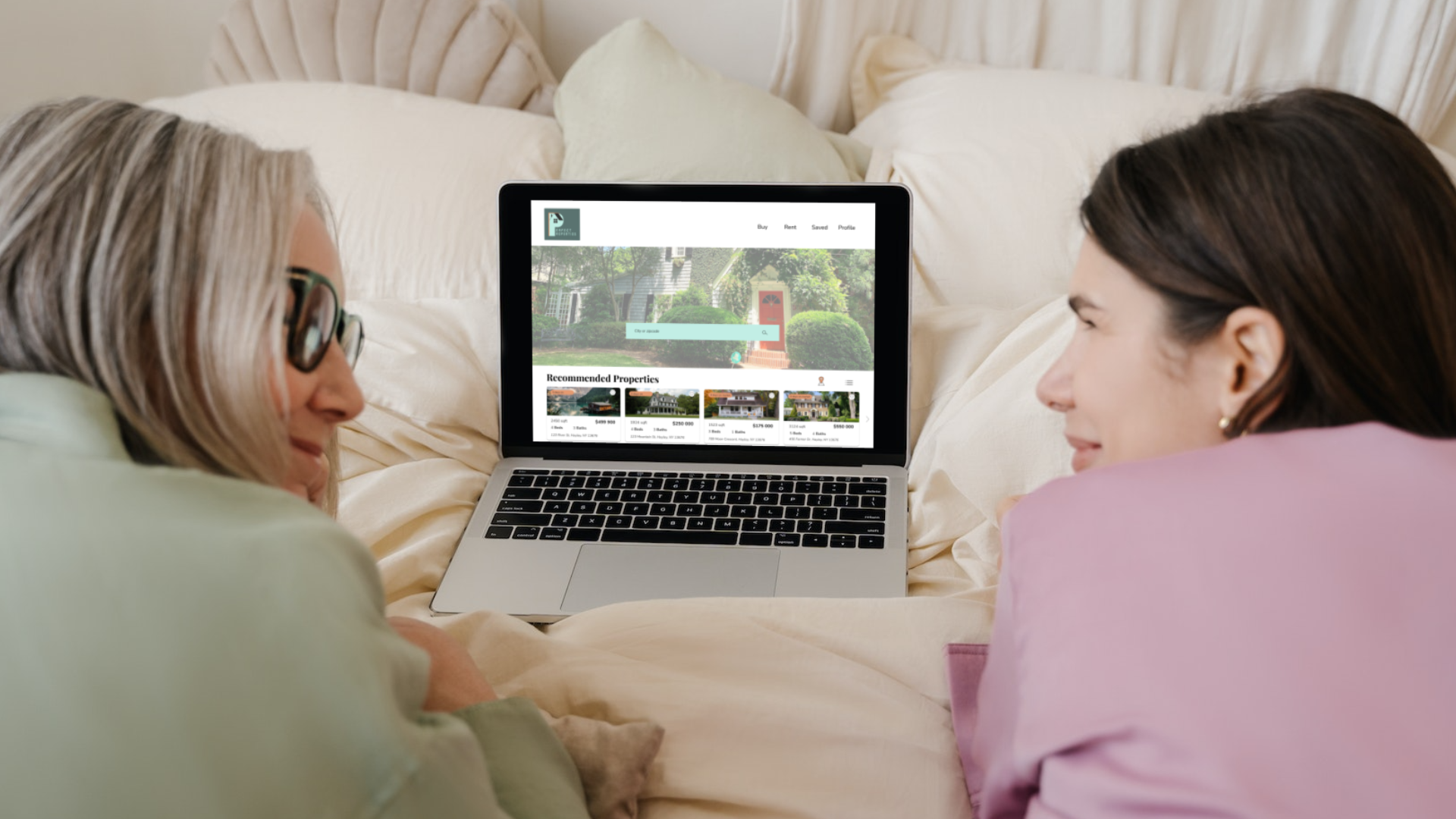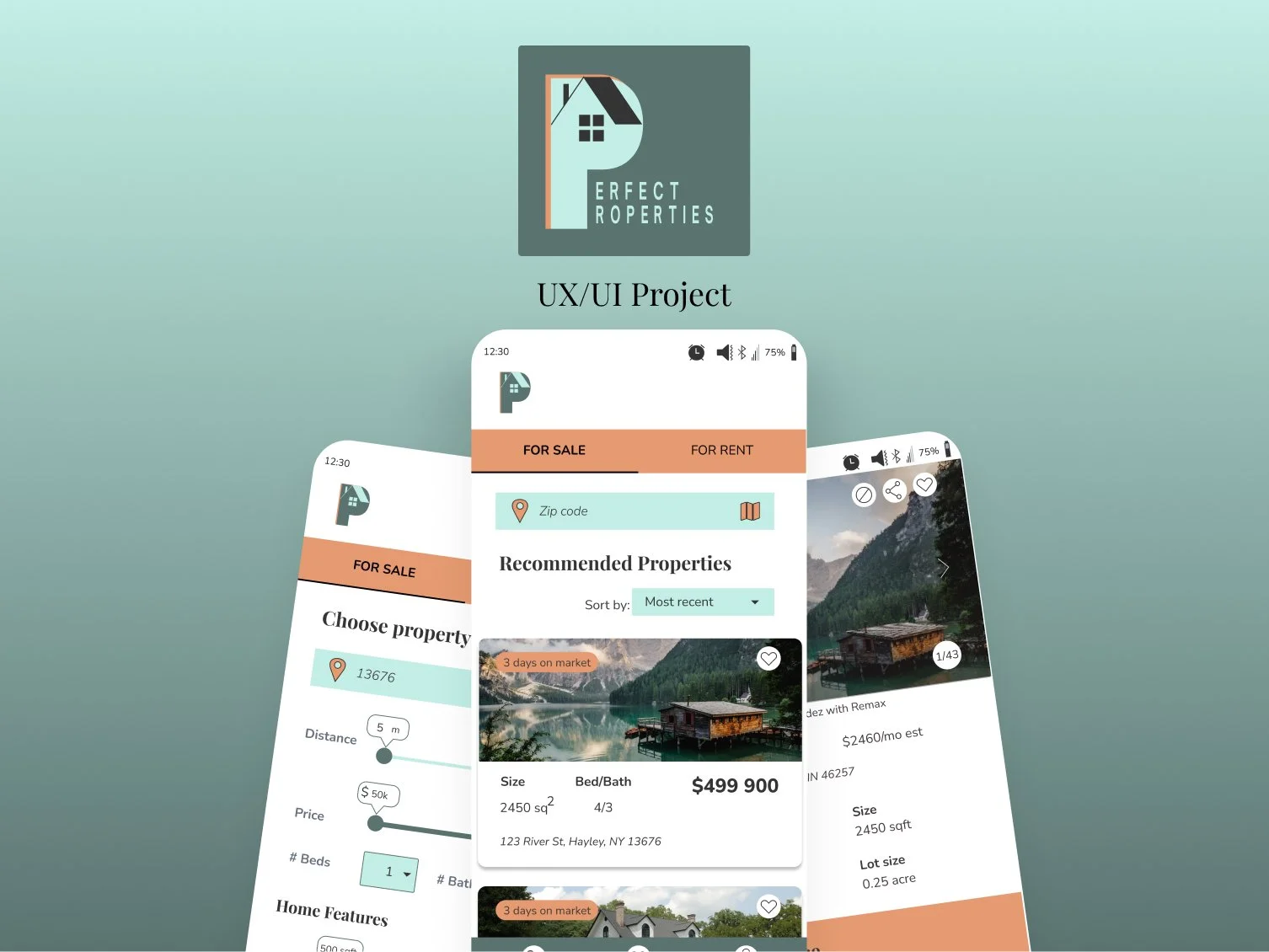
My Role
My role as a UX and UI designer, I was to leverage the insights gathered from the persona, Rashida, and her specific goals to shape the overall user experience.
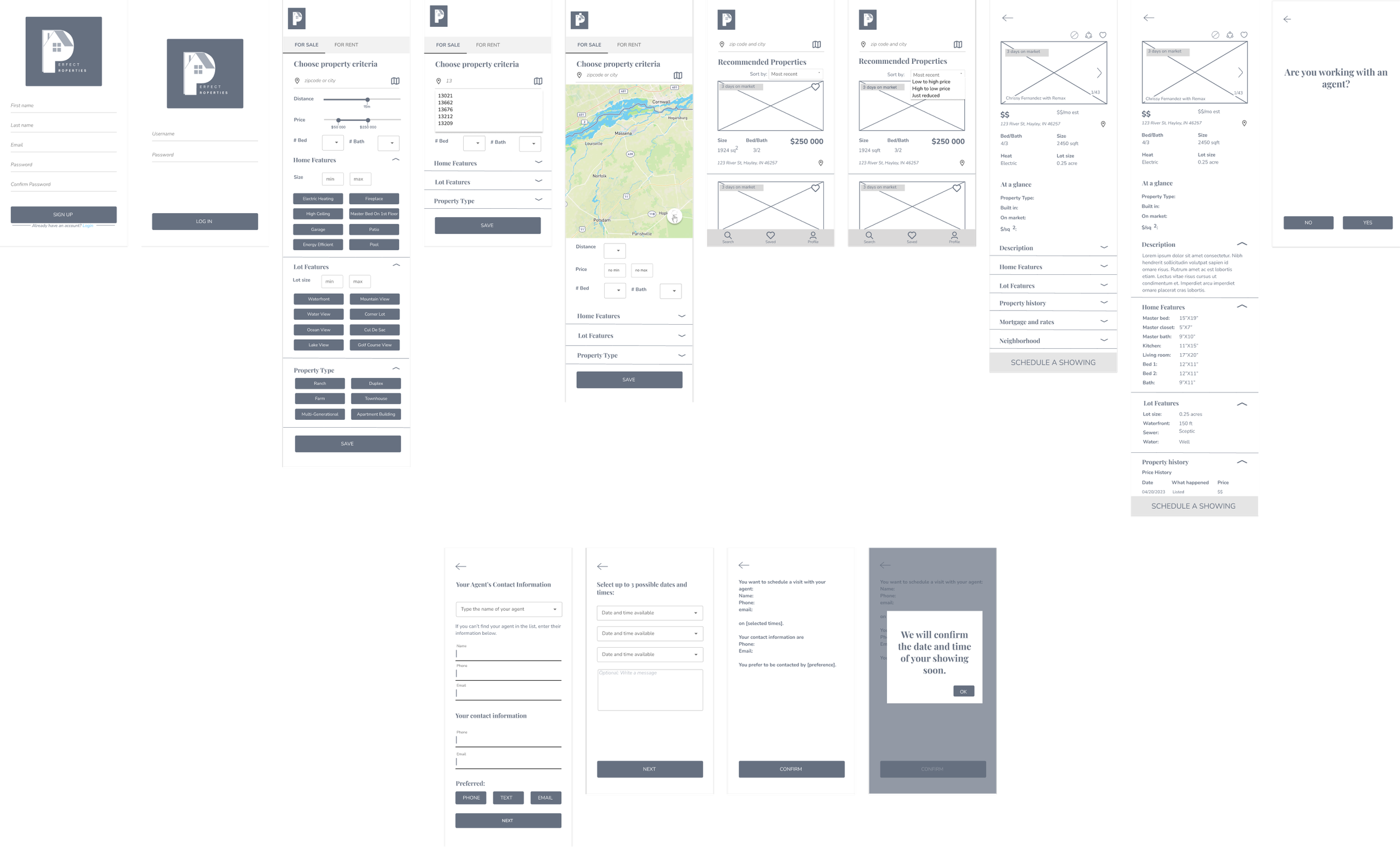
I designed low-fidelity wireframes to outline the basic structure and flow of the app. These initial wireframes served as a foundation for gathering feedback and iterating on the design.
Then, I built upon the feedback received, I advanced to mid-fidelity wireframes, refining the layout, interactions, and incorporated key design elements. This stage allowed me to strike a balance between functionality and aesthetics, ensuring an intuitive and engaging user journey.
Finally, transitioning to high-fidelity wireframes, I focused on adding visual polish and attention to detail, bringing the design to life with refined typography, color schemes, and visually appealing UI components.
Through meticulous attention to the user experience, I aimed to create a visually cohesive and delightful interface that would resonate with our target users.
My Goal
My goal with Perfect Properties was to simplify the property buying process for new buyers by providing a user-friendly web app that offers
Comprehensive information
Efficient property searches
Expert guidance.
I wanted to alleviate the complexities and challenges of the real estate market, empowering users to make informed decisions and save valuable time.
Persona
Meet Rashida, a driven and tech-savvy professional on a quest for financial security and a brighter future.
Her goals:
Achieve financial security.
Create a solid foundation for her family's future.
Invest in properties that can generate additional income and contribute to her long-term financial stability.
Find the right information efficiently, enabling her to make well-informed decisions and avoid wasting time on properties that do not align with her goals.
Quote: “ I want to provide my family with financial security. I’ve been considering buying property for a while, and am looking for a tool that can help me find what I’m looking for, quilckly!”
Join us as we walk alongside Rashida in her pursuit of the perfect property, discovering how our web app caters to her unique needs and empowers her decision-making process.
User Flows
Let's dive into the user flows tailored to address Rashida's specific needs and driven by three pivotal user stories:
Searching and filtering properties
Accessing comprehensive information
Scheduling viewings
Low Fidelity Wireframes
Transitioning from user flows to the visual manifestation of the design process, let’s look at the low-fidelity wireframes that form the backbone of our Perfect Properties web app.
As a UX designer, I understand the importance of adaptability and iterative design, which led me to leverage the power of Figma to craft wireframes that offer both flexibility and efficiency.
In the following sections, you will see the digital blueprints, showcasing how they evolved from conceptual ideas to tangible user interface components, all while retaining our intention: Empower the users with the expertise and tools they need to navigate the real estate market confidently and efficiently.
Mid-Fidelity Wireframes
After incorporating valuable feedback from my mentor and gathering insights from individuals in my network, I refined the design. See these mid-fidelity wireframes as a result of the iterative process.
To enhance the user experience, I replaced the checkboxes in the "Choose a property criteria" screen with intuitive buttons, allowing users to easily select their desired criteria.
Recognizing the importance of information presentation, I implemented an accordion-style layout in the sections of the “Choose property criteria” and “Individual property” screens, providing users with the ability to control the amount of information they wish to view, thereby reducing overwhelm.
To streamline the user journey and alleviate potential anxiety, I opted to consolidate all relevant information onto a single screen rather than utilizing multiple screens. This cohesive approach ensures that users have a clear understanding of the process duration and can navigate comfortably through the interface.
I introduced a dropdown menu, empowering users to prioritize and customize their search results according to their preferences. This added functionality enables users to find the most relevant options promptly, improving overall efficiency and satisfaction.
Through these design decisions, I aimed to create a more user-centered and seamless experience within the Perfect Properties mobile app.
Mood Board
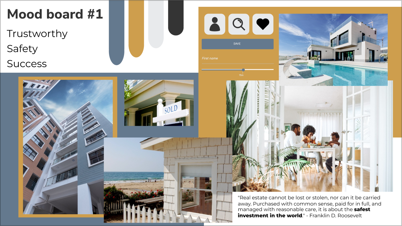
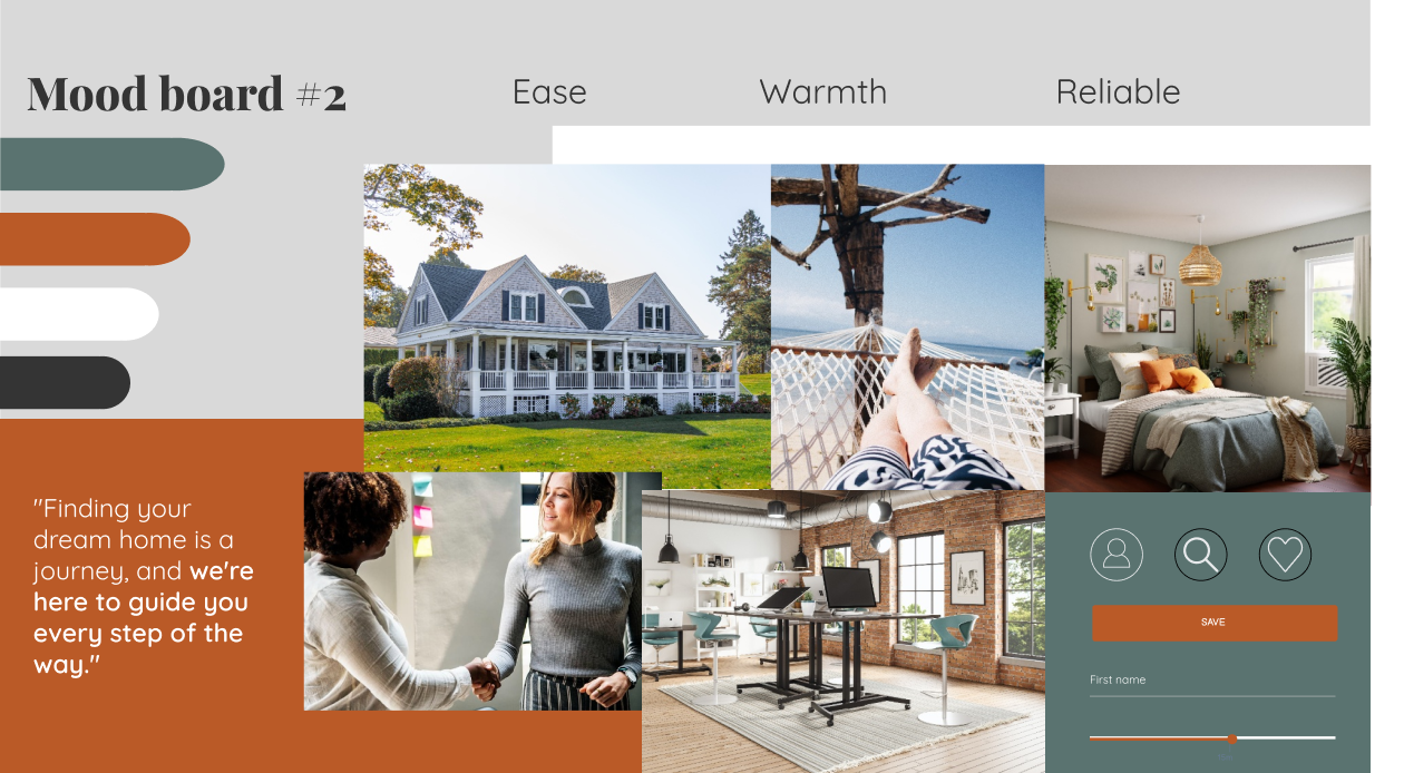
Based on the project brief, I created 2 mood boards. One that instilled Trustworthiness, Safety and Success and the sedcond one: Ease, Warmth, and Reliability.
I chose the second mood board.
The color scheme of green, orange, white, and black, conveys a sense of warmth, ease, and reliability. This could be appealing to potential buyers who are looking for an app that makes the real estate investment process feel more approachable and less intimidating.
The quote "Finding your dream home is a journey, and we're here to guide you every step of the way." also emphasizes the idea of guidance and support, which could resonate with new buyers who are looking for professional assistance in navigating the real estate market.
Overall, the second mood board is great for an audience that is looking for an approachable and supportive experience. The warm color scheme, quote, and images all work together to create a mood board that conveys a sense of ease, warmth, and reliability, which could be appealing to this audience.
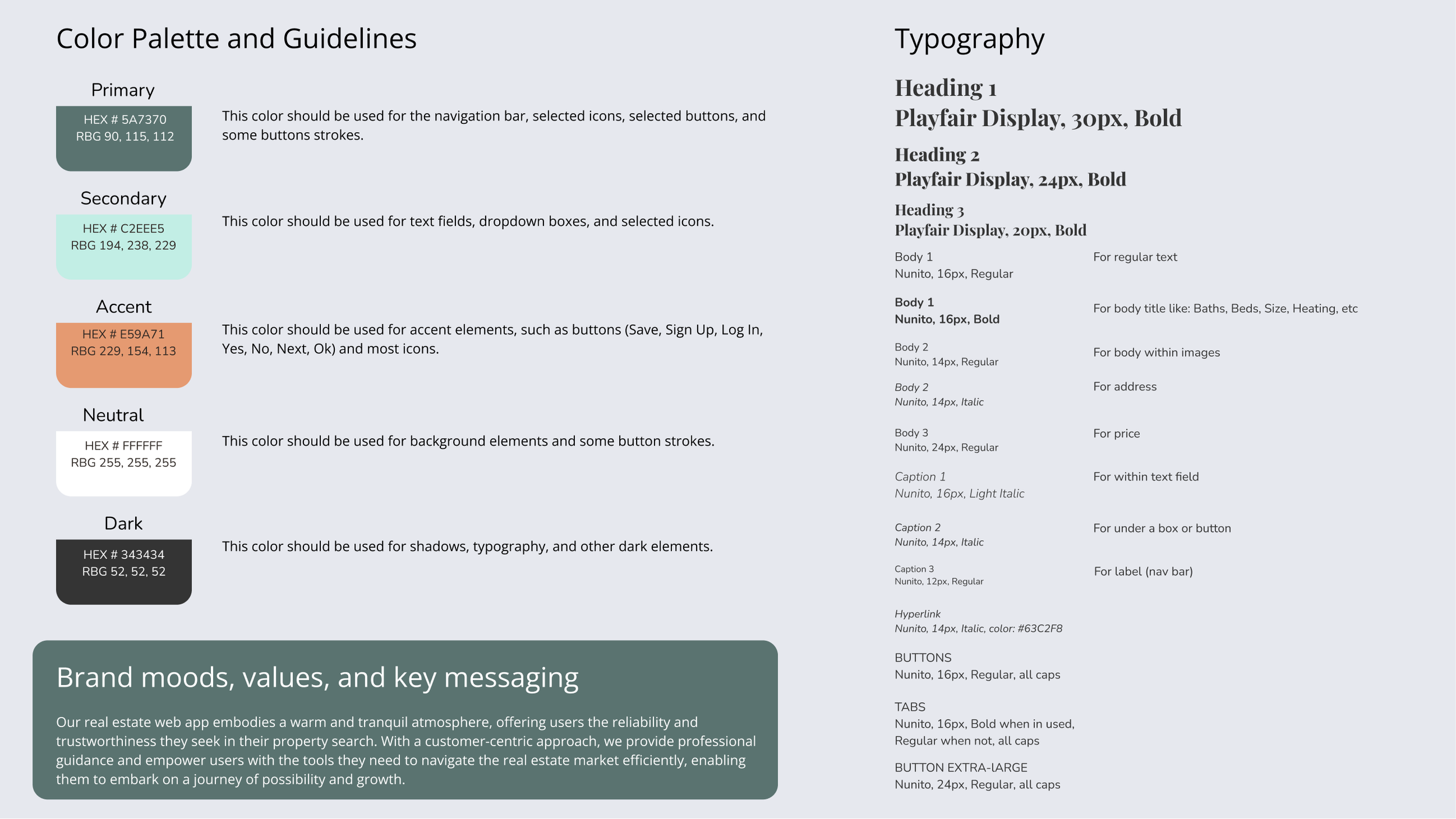
Style Guide
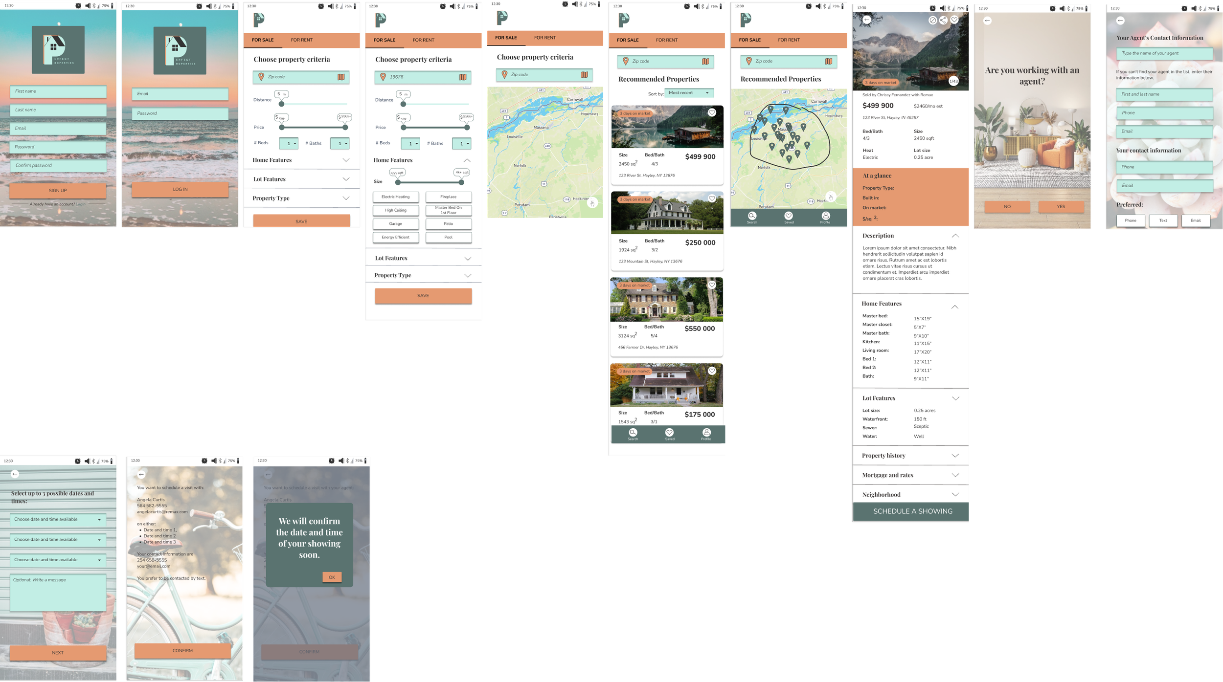
High-Fidelity Wireframes
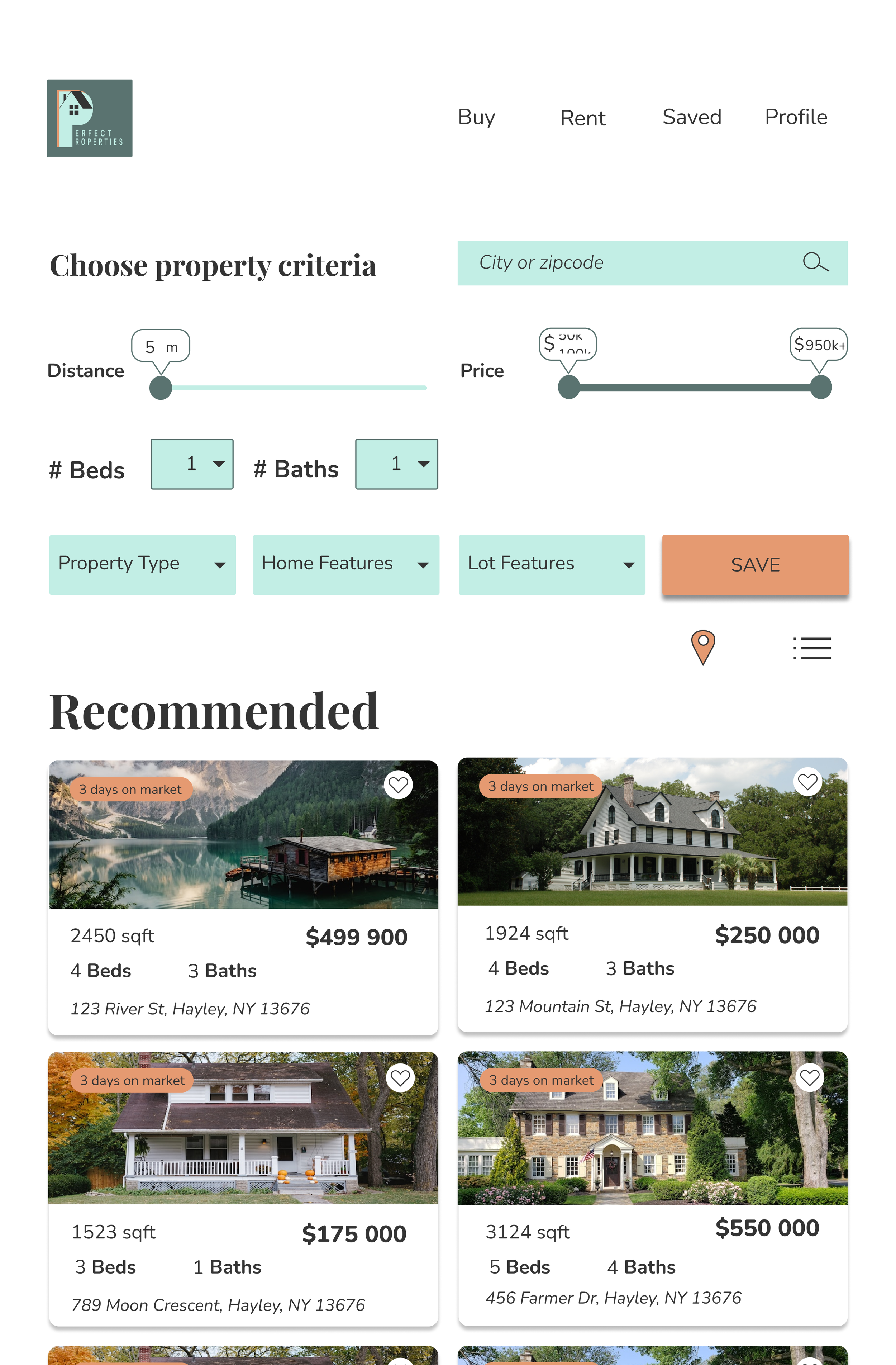
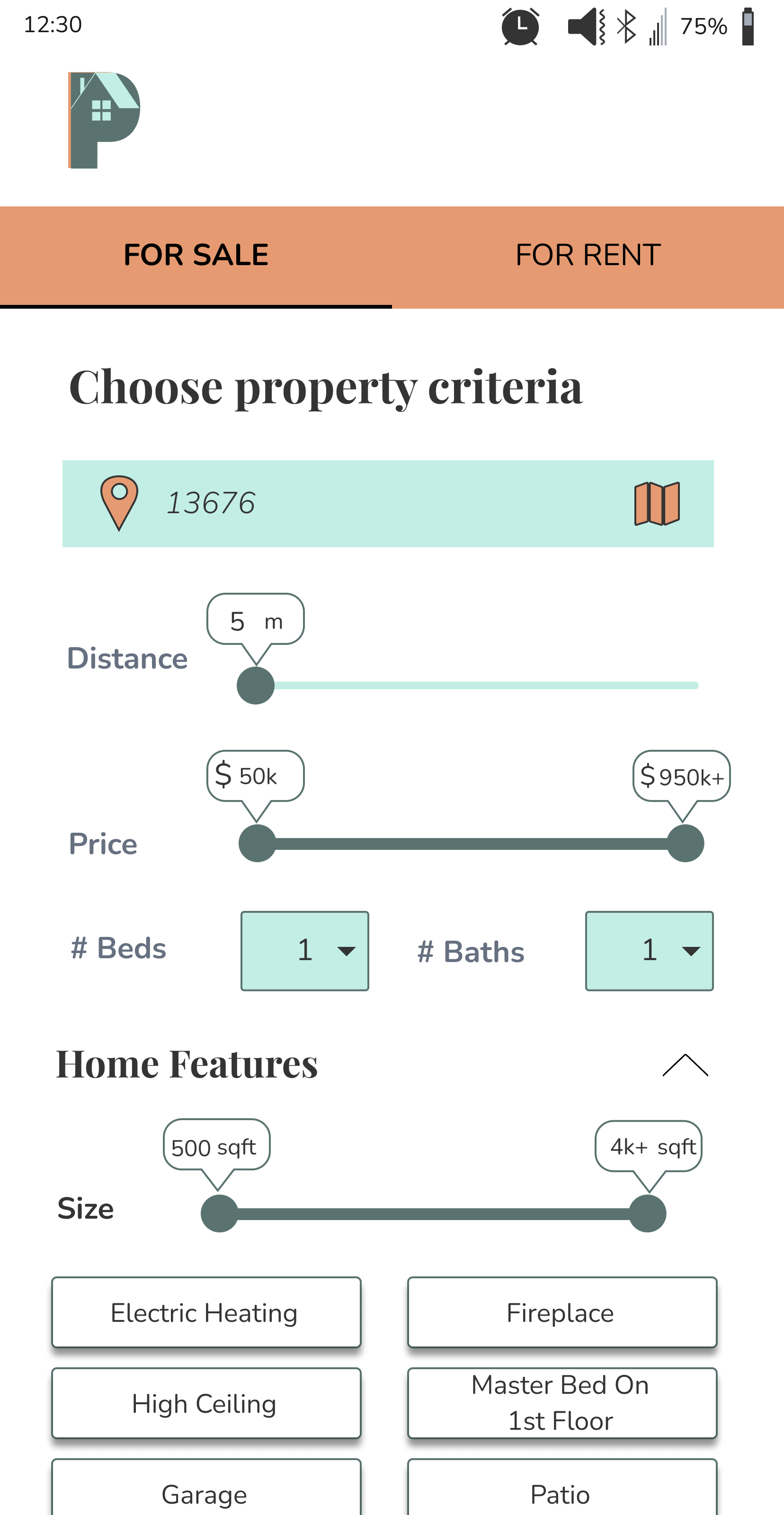
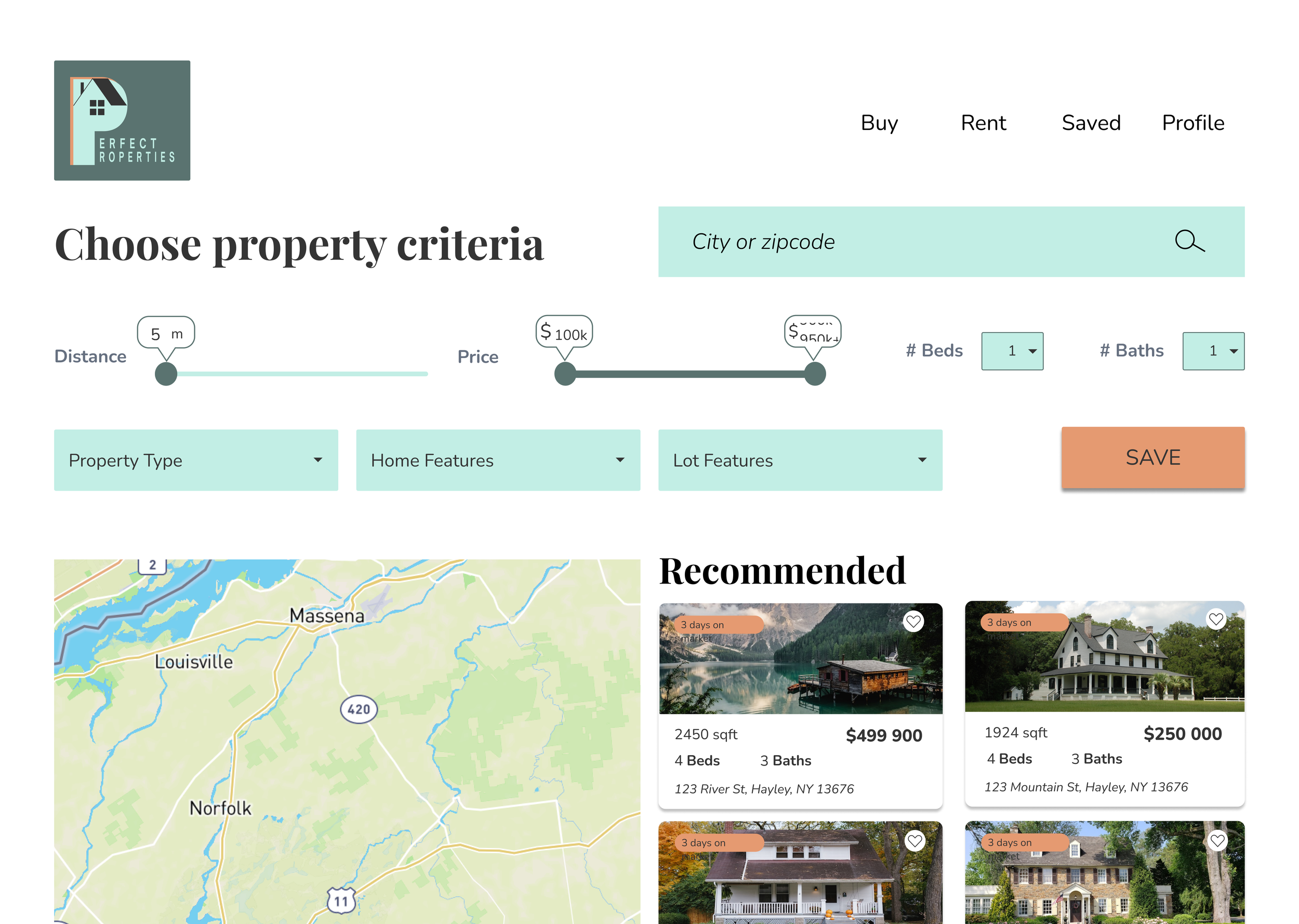
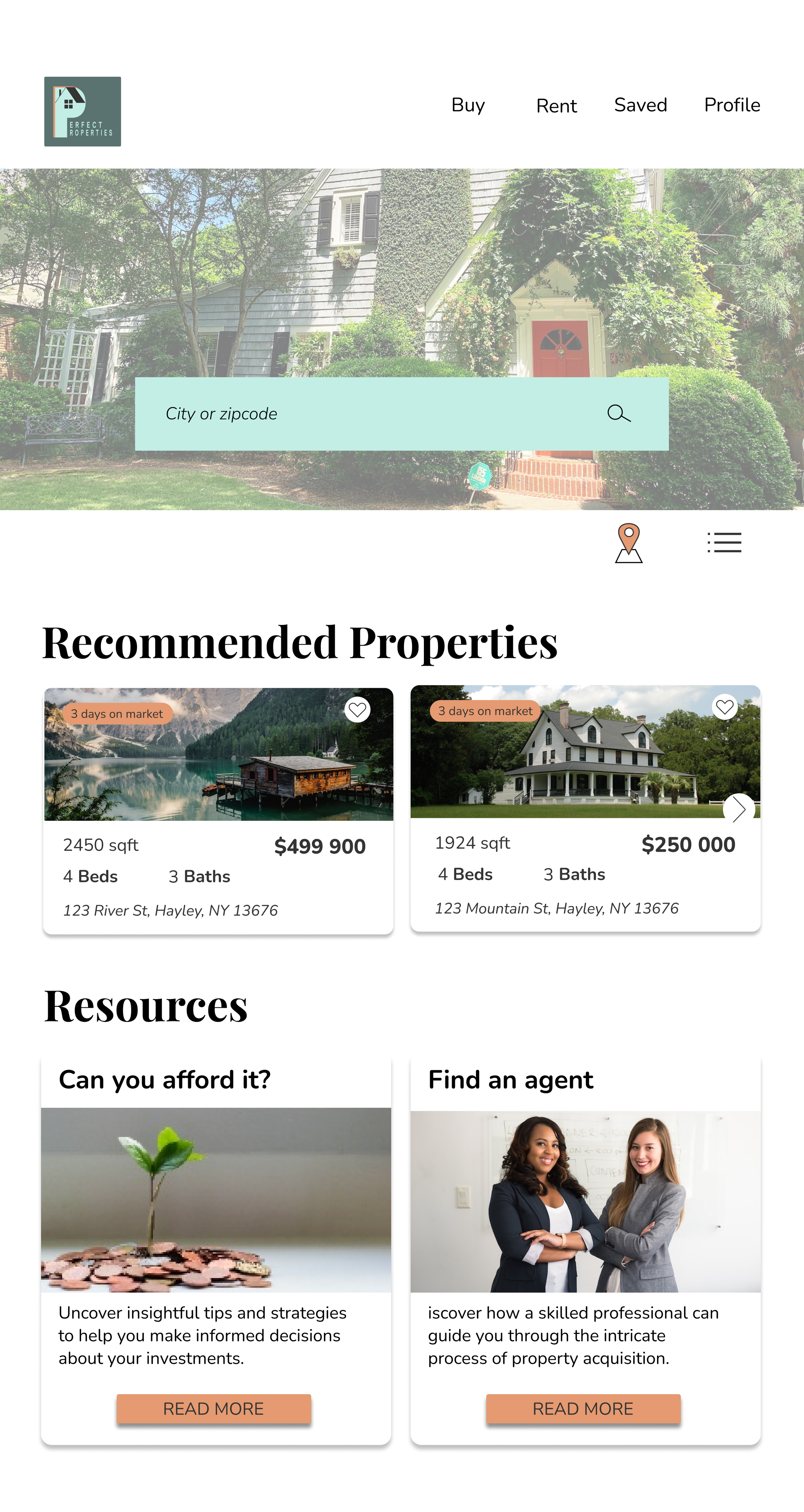
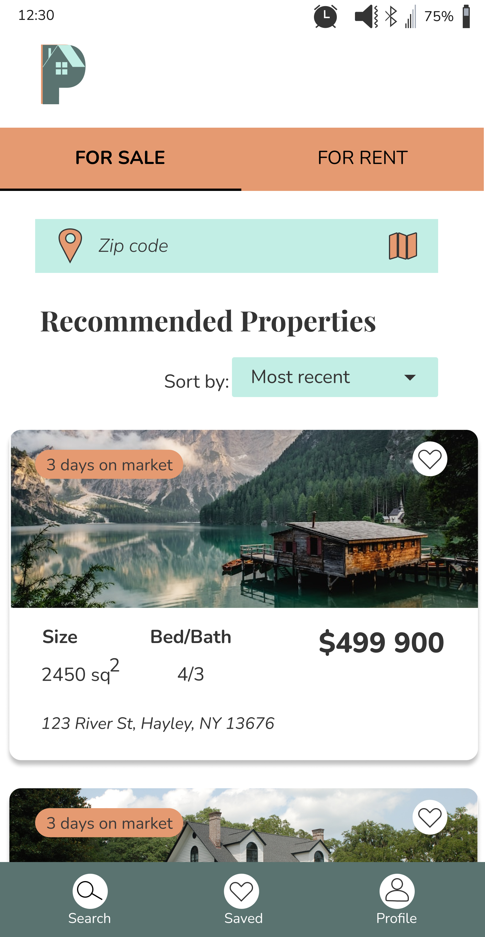
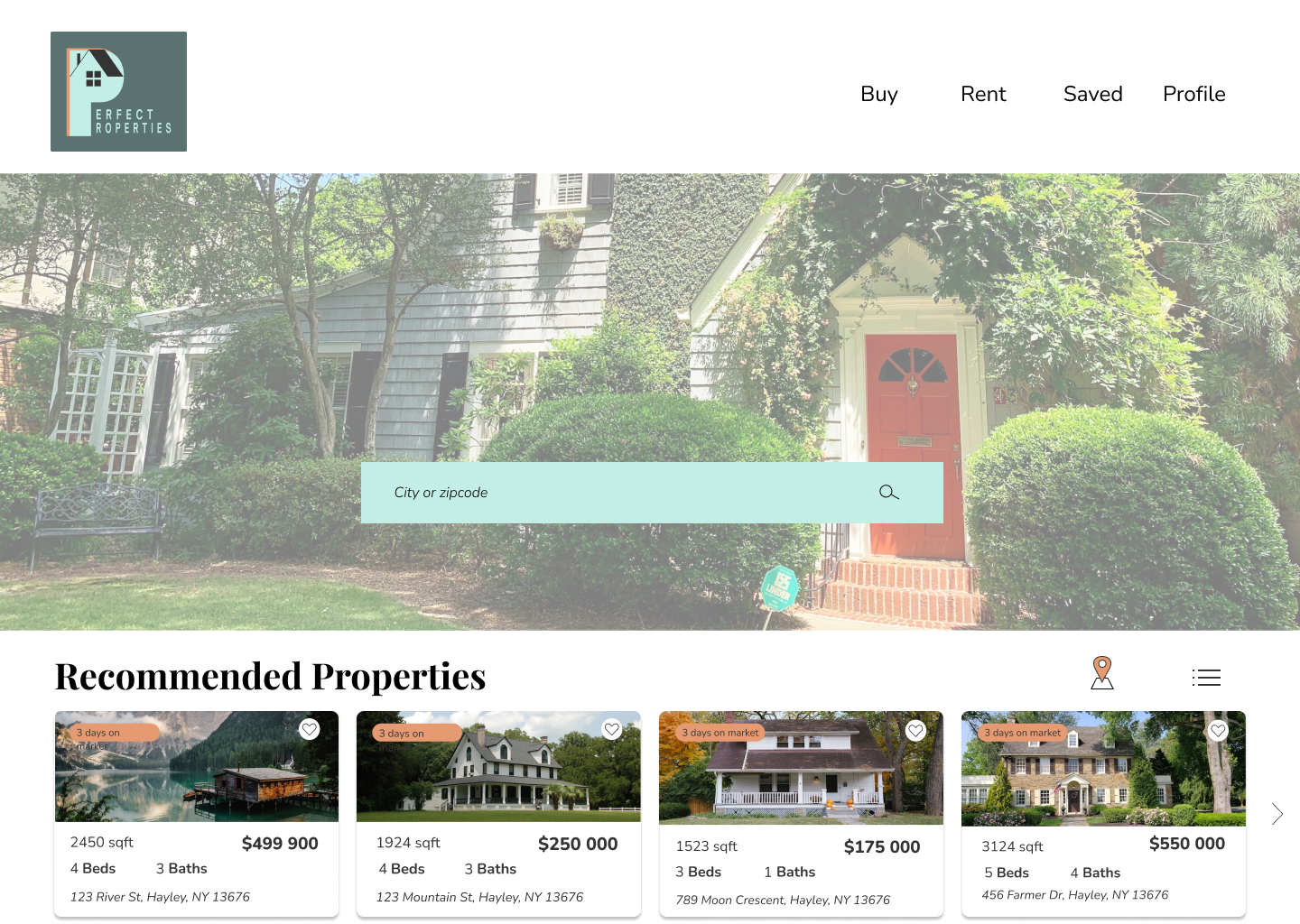
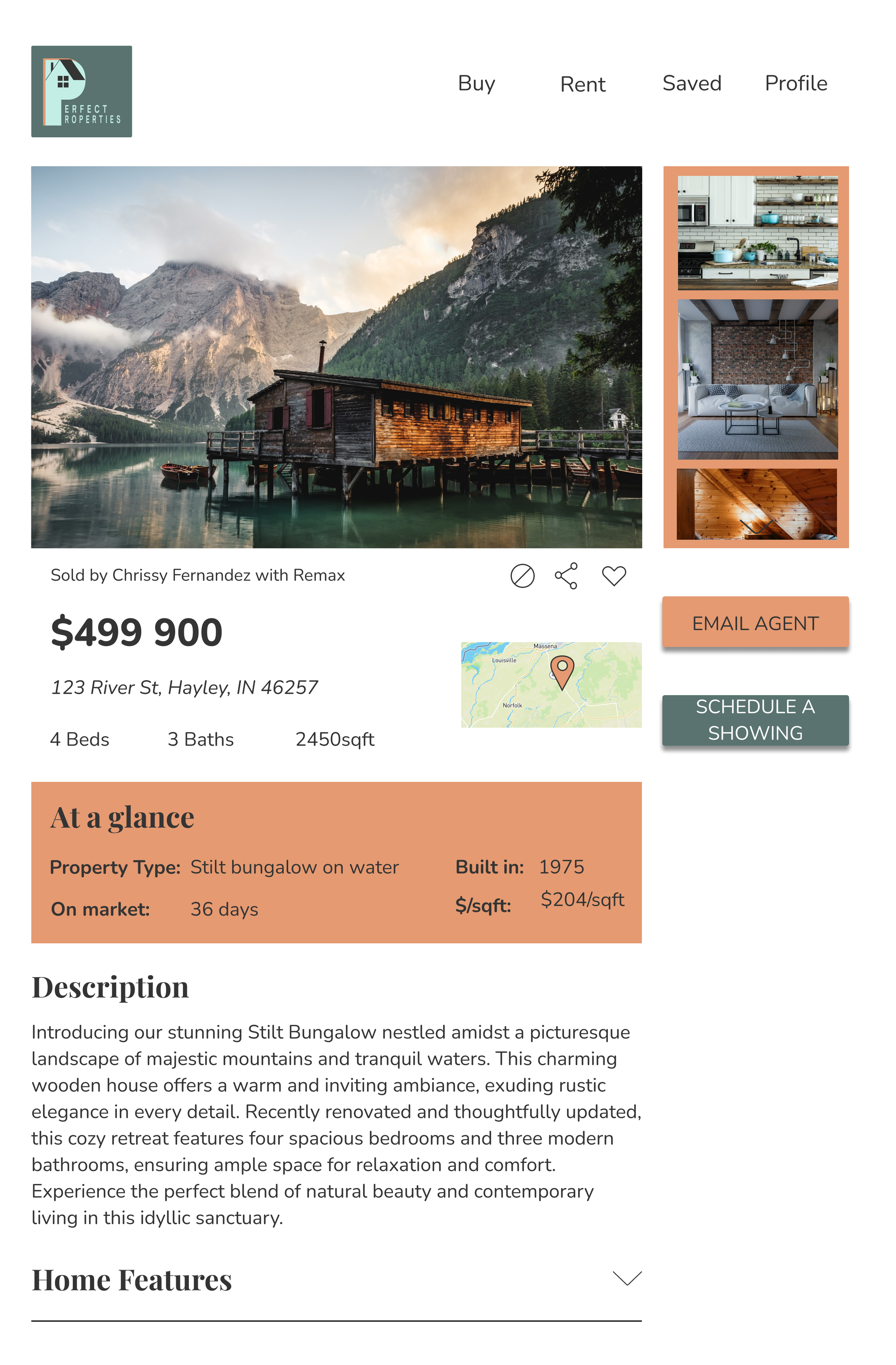
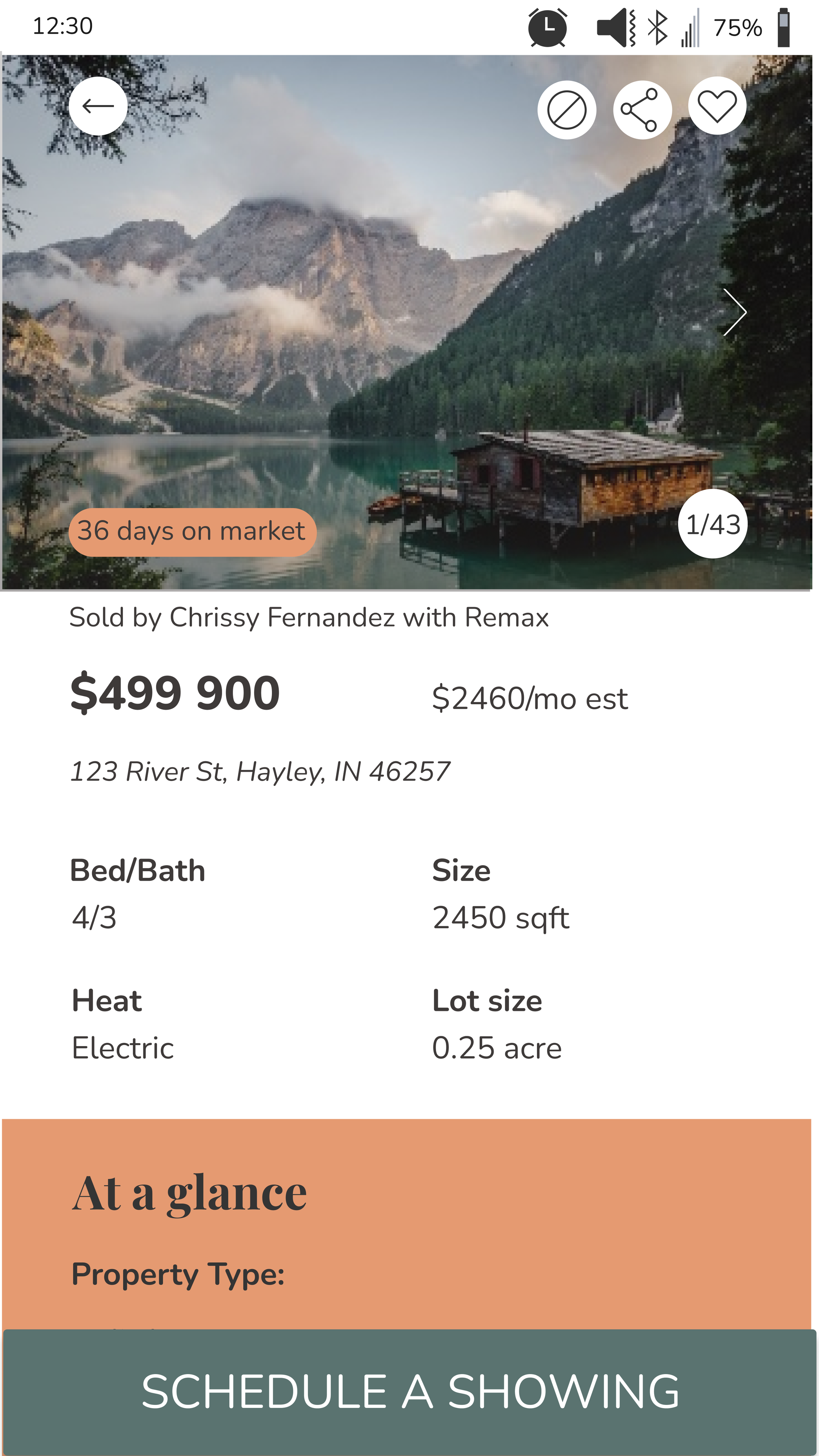
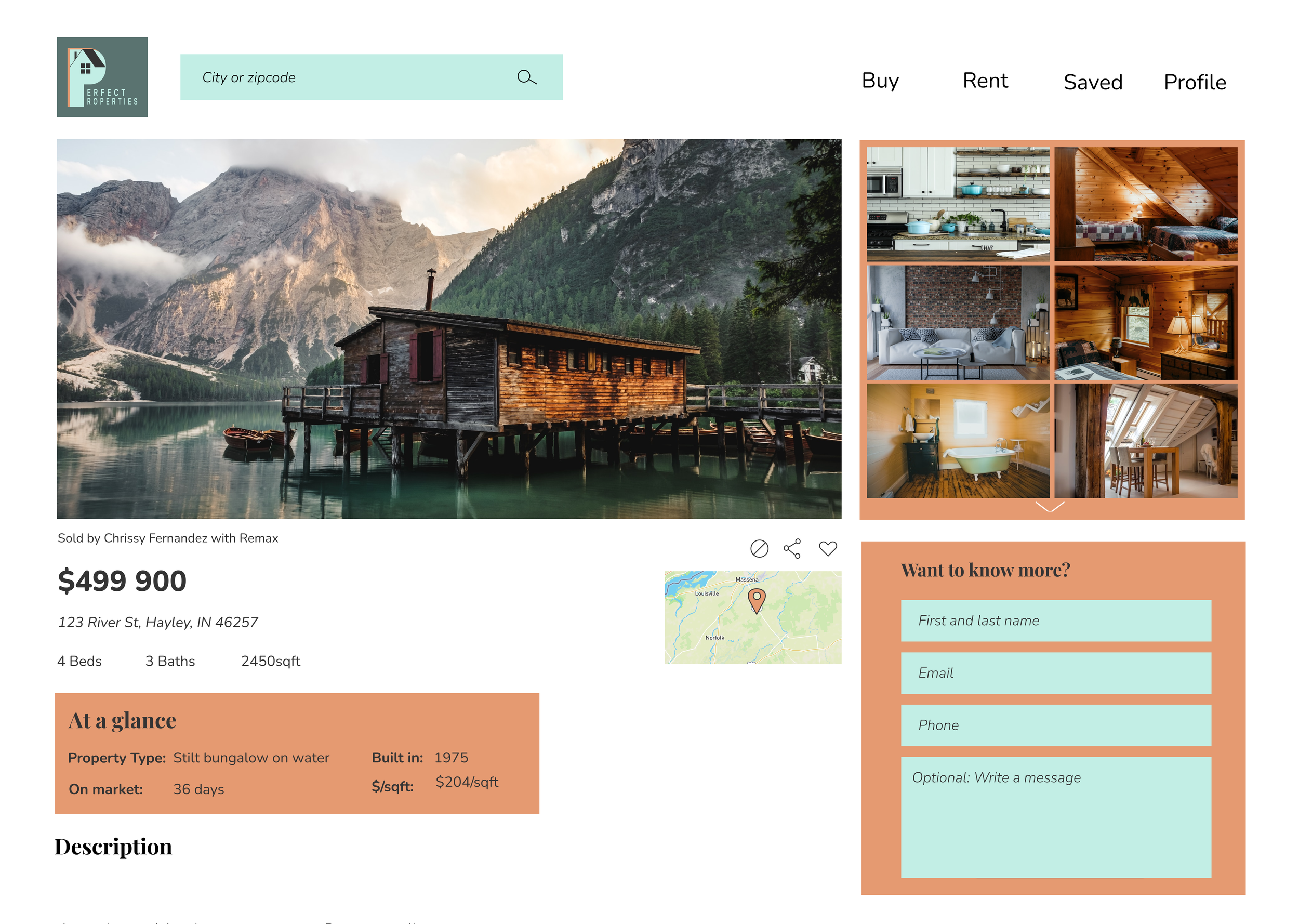
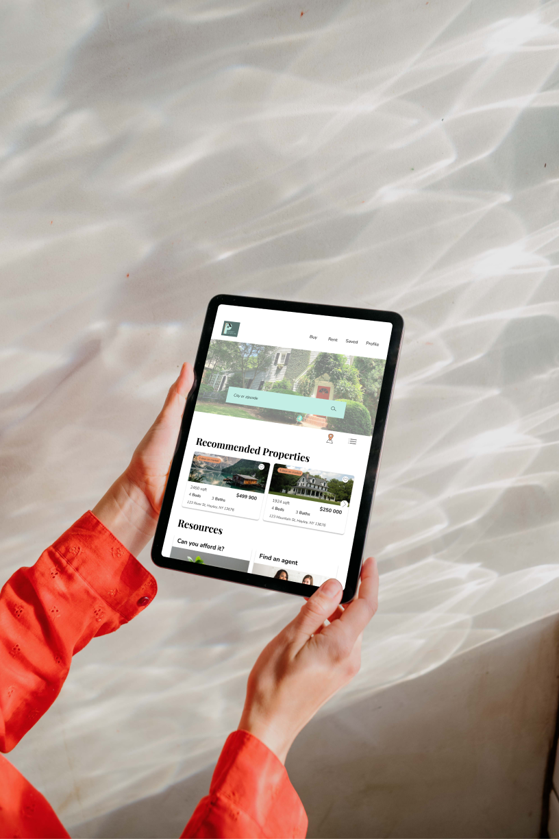
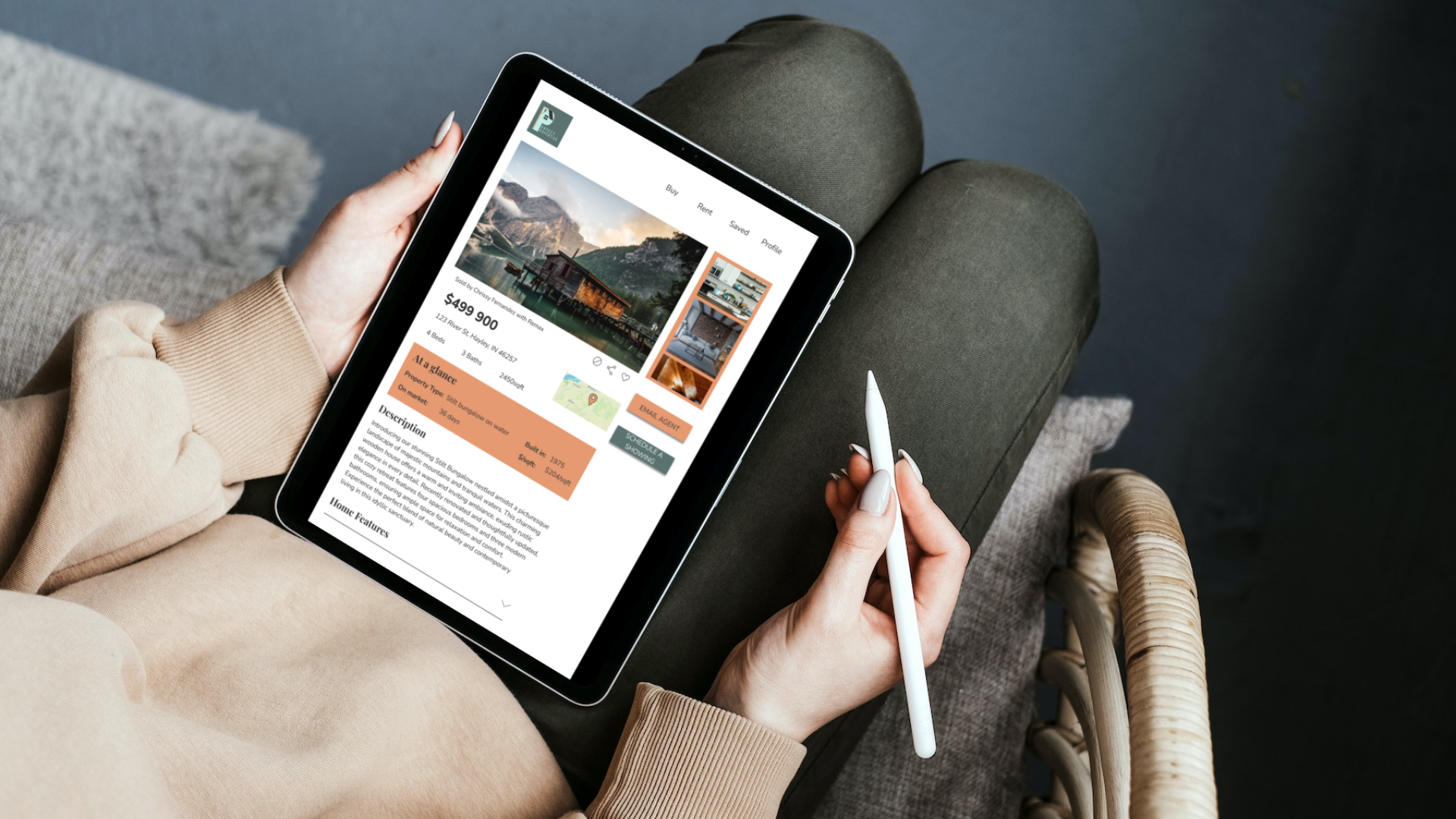
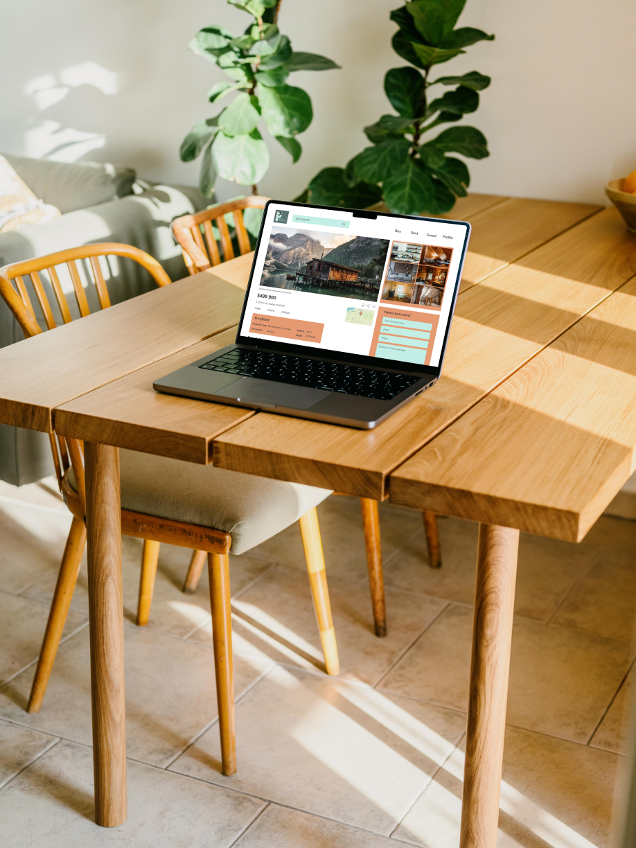
In the creation of the high-fidelity wireframes for Perfect Properties, I drew inspiration from the mood board and adhered to the style guide, resulting in a visually cohesive and polished design.
The carefully chosen color palette, typography, and UI elements reflect the desired emotions of warmth, reliability, and trustworthiness.
Each screen was crafted to bring the app to life, with attention to detail and consistent visual hierarchy.
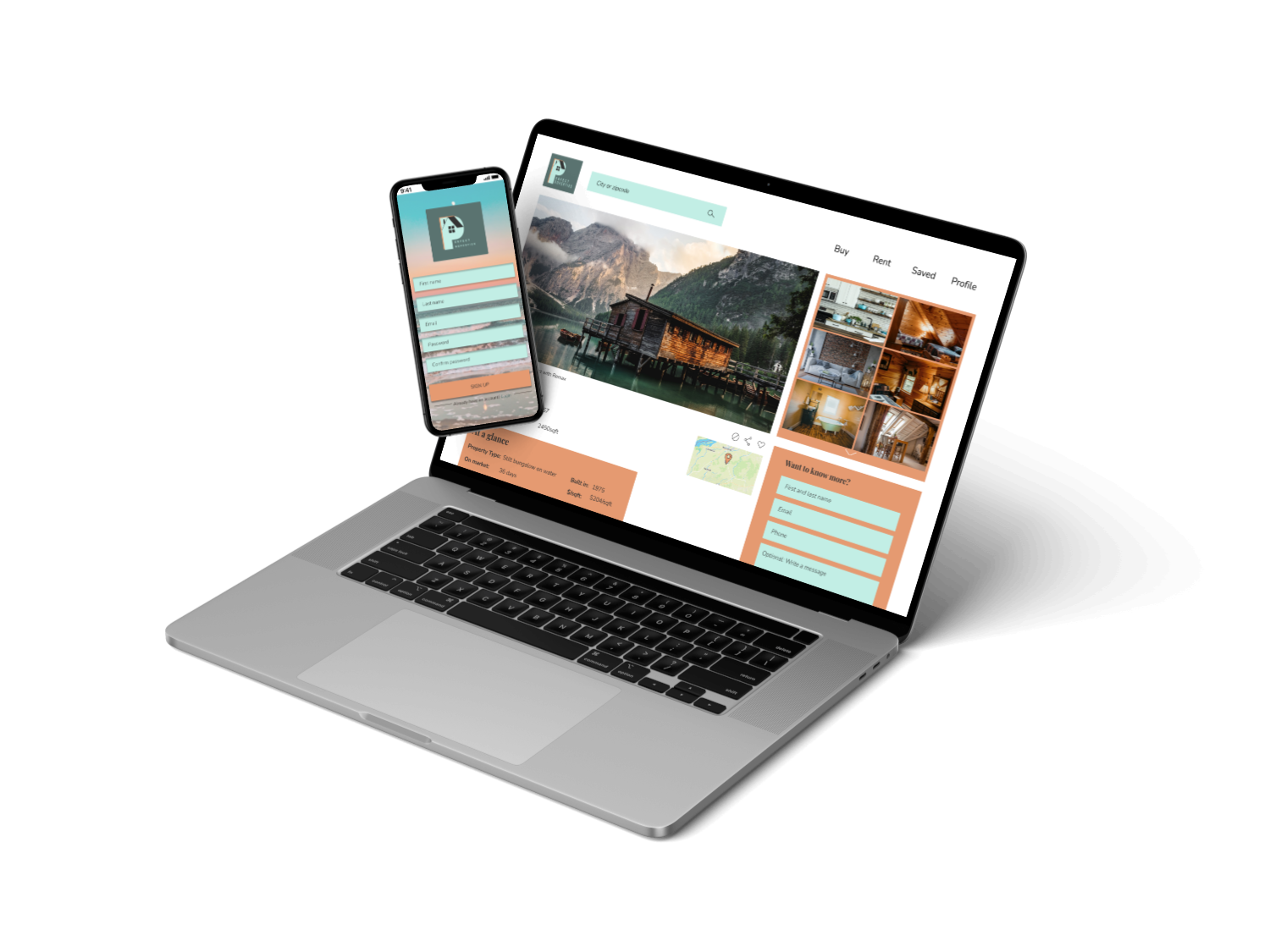
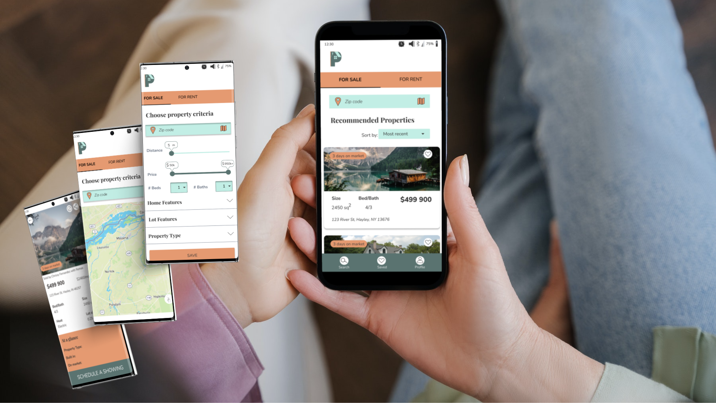
The high-fidelity wireframes showcase an immersive user experience that embodies the brand's values and aspirations, providing a seamless and visually stunning representation of the Perfect Properties app.
Animations and Prototype
Responsive Design for different Breakpoints
Mobile
Tablet
Desktop
Mobile
Tablet
Desktop
Mobile
Tablet
Desktop
My takeaways
Throughout the journey of tackling the Perfect Properties project, I gained valuable insights and experienced significant growth.
One of the key takeaways was understanding the importance of striking a balance between seeking feedback and refining designs independently. I learned to recognize when a design iteration was at a stage where it could benefit from external input versus when it was time to refine it further on my own. This discernment enabled me to progress effectively while continuously improving the project.
Additionally, this project served as an opportunity to enhance my proficiency with design tools and strengthen my organizational skills. As I delved deeper into the project, I became more comfortable with the tools at my disposal, allowing me to work more efficiently and produce higher-quality deliverables. Although I acknowledge that there is always more to learn, I am fueled by my passion for continuous learning and growth. This experience has instilled in me a sense of confidence in my ability to adapt to new tools and stay abreast of industry trends, ensuring my skill set remains current and relevant.
Overall, the Perfect Properties project has been a transformative experience, teaching me the importance of balancing feedback and personal refinement, while nurturing my passion for learning and reinforcing my adaptability in a rapidly evolving industry. These takeaways have not only enriched my approach to design but have also contributed to my growth as a professional UX designer.
Take a look at my other work:

